 Just showing off our latest from Peter Lutjen.
Showing posts with label Peter Lutjen. Show all posts
Showing posts with label Peter Lutjen. Show all posts
The covers that got away
I got batch of cover designs in today and immediately regretted that the one I liked the best, visually speaking, would never fly for the cover. In this case, with good reason — it looks great but isn’t quite suited for the audience. Luckily, there are others in the batch that also also very good and more appropriate for the book.
Also today, I got sketches in for another book. Here we are clearly we are making the less interesting choice because it more closely resembles familiar territory. The artist is no dummy and will likely reuse the pose on someone else’s very successful book cover. (And I will be jealous!)
This happens a lot in the job. Many times I agree with the final outcome, in some cases I don’t. Below are two older examples of covers that “got away.”
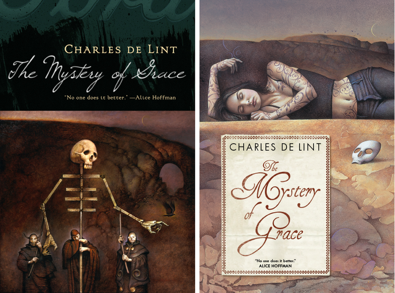
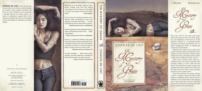
 The Mystery of Grace
Illustrator John Jude Palencar and designer Peter Lutjen have been the dynamic duo beyond many many Charles de Lint covers. It’s amazing how well their sensibilities work together, even more so when you consider that Charles, Peter, and John have never met.
 When Mystery of Grace came up, when we knew a general outline of the story. John Jude sent in a series of sketches and I was blinded by how much I loved this puppeteer drawing. It makes for a great painting, and even a great cover, but when the author and editor brought up the fact that it was much too dark for the book, it was hard too fight it. It certainly is macabre. This is not the artist’s fault. If I had been thinking more clearly, I would have asked for other sketches. In this case we got as far as printing Advance Reading Copies with the puppet cover before we were able to about-face and start over. (I’m told you can find those advance reading copies on eBay every now and then.)
Since we do have such a long and wonderful history of Palencar covers on de Lint books, there was never a question of what to do — I went back to John, described the book more fully, and gave him a clearer understanding of how we wanted to position it. It was a whole second commission for him — a pricey mistake on my part but, thankfully, not one that I make too often. In the end, the second cover is just as lovely in a different way.

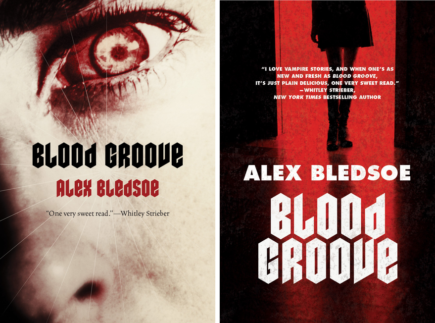
Blood Groove
In this case, it was tough to get the marketing tone right. The initial copy and the title made it sound a bit campy and hipstery. When talking to the editor, the book sounded much more gritty than that, and it sounded much more grisly than the current slew of hot Twilight-y vampires. Designer Jamie Stafford-Hill went to town on the idea of a truly horrific, old school vampire. What you can’t see here is, he even requested a slightly textured varnish to make the cover just a tiny bit pebbly your hand. We did an advance run on the jackets and they looked great. Really great. In the end, though, Sales and Marketing felt that we should try to hit larger audience an go with a “movie-poster” style cover.
Selling more books is good for everybody — everyone from the author, to the bookstore clerks, to the truck drivers moving inventory around — so it’s difficult to say that going more commercial is a bad thing...But truth be told, this was example where I wish we could have stuck with something that was a bit more unique and engaging. While I certainly like the re-do, quite a bit actually, I’ll always wonder which cover really would have performed better.
Also today, I got sketches in for another book. Here we are clearly we are making the less interesting choice because it more closely resembles familiar territory. The artist is no dummy and will likely reuse the pose on someone else’s very successful book cover. (And I will be jealous!)
This happens a lot in the job. Many times I agree with the final outcome, in some cases I don’t. Below are two older examples of covers that “got away.”
 The Mystery of Grace
Illustrator John Jude Palencar and designer Peter Lutjen have been the dynamic duo beyond many many Charles de Lint covers. It’s amazing how well their sensibilities work together, even more so when you consider that Charles, Peter, and John have never met.
 When Mystery of Grace came up, when we knew a general outline of the story. John Jude sent in a series of sketches and I was blinded by how much I loved this puppeteer drawing. It makes for a great painting, and even a great cover, but when the author and editor brought up the fact that it was much too dark for the book, it was hard too fight it. It certainly is macabre. This is not the artist’s fault. If I had been thinking more clearly, I would have asked for other sketches. In this case we got as far as printing Advance Reading Copies with the puppet cover before we were able to about-face and start over. (I’m told you can find those advance reading copies on eBay every now and then.)
Since we do have such a long and wonderful history of Palencar covers on de Lint books, there was never a question of what to do — I went back to John, described the book more fully, and gave him a clearer understanding of how we wanted to position it. It was a whole second commission for him — a pricey mistake on my part but, thankfully, not one that I make too often. In the end, the second cover is just as lovely in a different way.
Blood Groove
In this case, it was tough to get the marketing tone right. The initial copy and the title made it sound a bit campy and hipstery. When talking to the editor, the book sounded much more gritty than that, and it sounded much more grisly than the current slew of hot Twilight-y vampires. Designer Jamie Stafford-Hill went to town on the idea of a truly horrific, old school vampire. What you can’t see here is, he even requested a slightly textured varnish to make the cover just a tiny bit pebbly your hand. We did an advance run on the jackets and they looked great. Really great. In the end, though, Sales and Marketing felt that we should try to hit larger audience an go with a “movie-poster” style cover.
Selling more books is good for everybody — everyone from the author, to the bookstore clerks, to the truck drivers moving inventory around — so it’s difficult to say that going more commercial is a bad thing...But truth be told, this was example where I wish we could have stuck with something that was a bit more unique and engaging. While I certainly like the re-do, quite a bit actually, I’ll always wonder which cover really would have performed better.
Jon Foster: Boneshaker and sketches
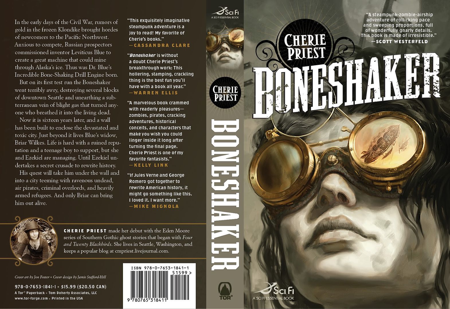
 Cherie Priest's Boneshaker
Art by Jon Foster.
Design by Jamie Stafford-Hill.
And check out Cherie Priest's website for series, The Clockwork Century.
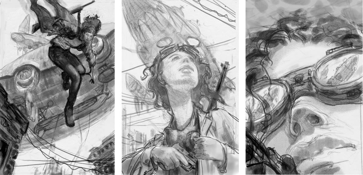
The first sketch was a real contender. It had action and might have more commercial appeal than the others. The second sketch looked a little too young-adult so that was ruled out fairly quickly. (Although it would make for a great YA cover.) The third one seemed slightly riskier than the others but also felt like, if all the pieces fell into place, it would be demand attention on the shelves. I'm very glad it's the direction we took.
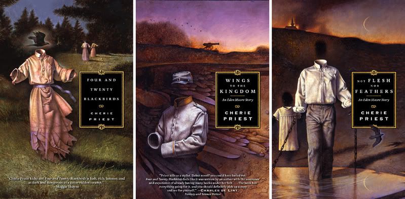 I have to admit, it does seem as though some authors have good cover karma. (Which unfortunately also means the reverse can be true.) I equally love the John Jude Palencar arted, Peter Lutjen designed, covers on Cherie Priest's "Eden More" books.
Some book covers featuring techno geekery, contemporary Shakespearean fantasy, and zombie-zeppelin-steampunk fiction.
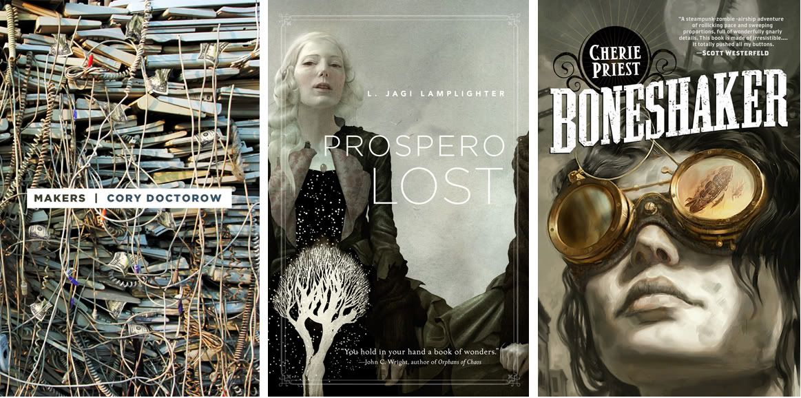 I don't seem to be able to get to any real post writing. I hope to soon, but in the meantime I can show off some pretty covers for upcoming Fall books. This is the gray suite.
Makers
Design by Peter Lutjen
Prospero Lost
Art by Sam Weber, design by Jamie Stafford-Hill
Boneshaker
Art by Jon Foster, design by Jamie Stafford-Hill
Never Slow Dance with a Zombie, or, emo zombie boy FTW!
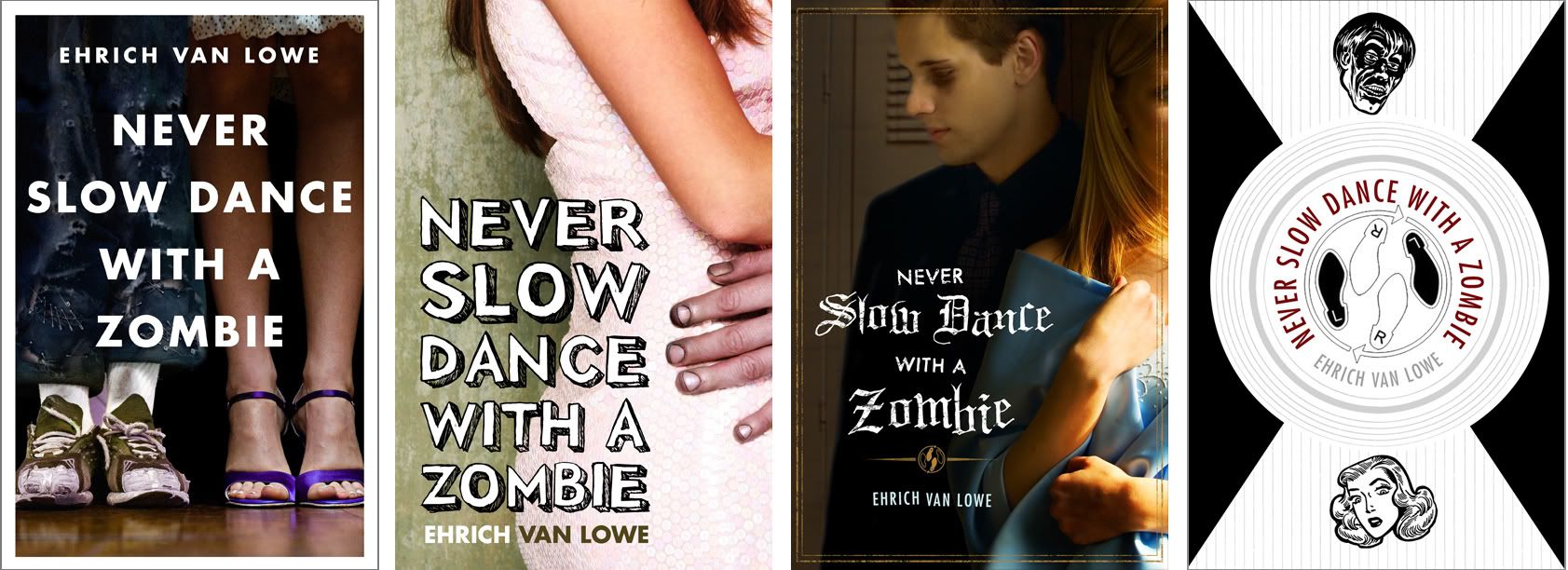
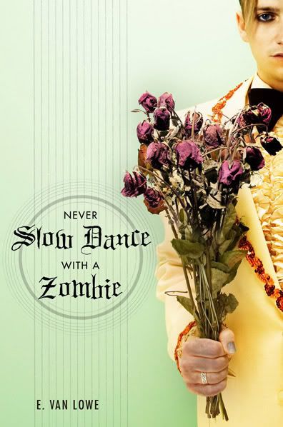 The latest from designer Peter Lutjen.
Never Slow Dance with a Zombie by E. Van Lowe, is a young adult book about the trials and tribulations of dealing with zombie boys.
Peter has a lot of warm playfulness in his design work, just perfect for this project. But the heartache of working with Peter is, often there are too many great options to chose from.
I love each of these for different reasons. But in the end, I came strongly on the side of the "flowers" version, which, thankfully,was the one approved. Although it was touch and go for a while...
I love each of these for different reasons. But in the end, I came strongly on the side of the "flowers" version, which, thankfully,was the one approved. Although it was touch and go for a while...
My second favorite was "feet". I know, there are tons of covers that just show legs, but it was so easy to imagine the girl trying to stand tall and look sophisticated next to the disheveled zombie sneakered boy. Sales nixed it right off the bat. I never really got a sense why.
For a while "pink dress" was in the lead - they liked seeing the girl. I liked this a lot and would have championed it...except there was something so funny-yet-sweet-yet-sad-and-cute-but-mostly-funny about the zombie suitor.
"Locker" is cool looking but better for a vampire book. It was briefly held up as a favorite but I'm glad we were able to steer everyone away from Twilight-fever. I actually didn't show it the first time around, for fear of said Twilight-fever, but at one point people were asking about it being more romantic, so I threw it into the mix.
Black and white "Dance" version is full of awesome, but better for an older crowd.
In the end, the editor and I were rooting for Flowers, while others were backing Pink Dress. At that point it came down to a "focus group" of four or five kids someone knew, all of which went with the flowers...Proving what I always suspected: My taste have not risen since I was 14.
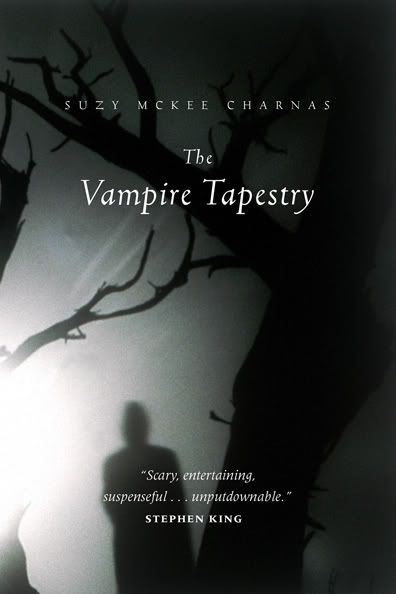
Mystery of Grace
 I love the creative triad that is Charles de Lint, John Jude Palencar, and Peter Lutjen. For years now, these have often been among my favorite Tor covers.
Facelifts vol.8
 We just finished up our Fall 2008 catalog. I'll share some of the covers throughout the upcoming months, starting with...
This ominbus edition edition of Ken MacLeod's The Star Faction and The Stone Canal. Design by Peter Lutjen.
Facelifts vol.7


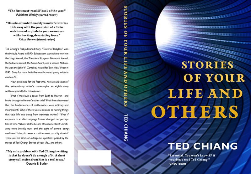 We’re doing a reprint of Stories of Your Life by Ted Chiang. The process of reprints is supposed to be somewhat automated -- we are not re-soliciting the books to bookstores so no one asks us to revisit the packaging. Occasionally, I can’t resist. It does, however, mean that we need to come up with something without spending any money on it. In this case, Peter Lutjen rose to the challenge. Honestly, I like all four but the top version is the one that kept being pinned as a favorite.
Little Brother

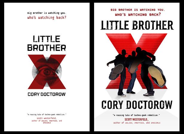
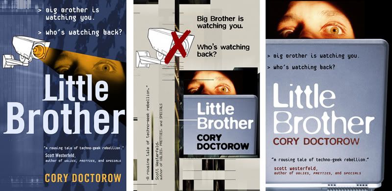
 In May we will be publishing Cory Doctorow’s young adult novel, Little Brother.
This was a fun, if a little scary, cover for us. We always smile when to comes to Cory but this book, in particular, really caught everyone’s fancy. The whole company just fell in love with it and there was a lot of pressure to do right by it.
Peter Lutjen came up with a bunch of different designs that eventually evolved into the final. The penultimate version used a photo-realistic illustration that everyone almost loved. One last tweak of the design was to have the imagery re-drawn in a freer more organic style by Yuko Shimizu -- that seemed to unify everything to everyone’s liking.
Big thanks to Peter for staying enthused by the project through a number of iterations. I asked him if he had any thoughts on the process:
"This was a case where having an opportunity to read the manuscript was a huge help. My initial comps were based on a synopsis and some catalog copy and focused on elements of surveillance and captivity. After quite a few of these didn’t work out, I made time to read the book (which was terrific) and set off in a completely different direction. The editor came by my office to speak to me about playing up the resistance aspects of the story at the same moment that I was working on an image of kids kicking out towards the viewer. He liked it the idea immediately, and it came together pretty quickly from there." -- Peter Lutjen
PHOTO: Editor Patrick Nielsen Hayden, author Cory Doctorow, designer Peter Lutjen..
UPDATE: Kudos from Cory on BoingBoing.

Winter 2008 Catalog

 We just wrapped up the Winter 08 hardcover catalog. Tor puts together three catalogs a year which means four months of book covers need to be completed by one date each season. Of course it always gets a bit hairy towards the end and inevitably things get tweaked as the season progresses. I say “tweaked” in both less and more, sometimes much more, generous terms.
I think we are in pretty solid shape this season -- thanks, always, to my incredible staff. Seriously. These guys are amazing. Great designers that never seem to get flustered with all the changes and last minute additions. Our unsung hero, especially around catalog time, is Vanessa Paolantonio. Besides her own design work she has the thankless job of keeping the rest of us on track. (Hmmm, it may be time for a group “Yay us!” lunch.)
Now that the catalog is done the next thing that happens is the sales conference. At that point, any of the covers can still get nixed if our reps feel they just aren’t hitting the mark. Often we get away clean — by now we have been trough a number of dress rehearsals for that meeting -- but it’s not uncommon, either, for one cover to be completely scrapped at that point. We’ll see how well we do in August .
Here are a few random Winter 08 covers.
In the Court of the Crimson Kings: Sequel to The Sky People. Art by Greg Manchess. Anytime we can make sci-fi pink is a good time.
Pebble in the Sky: Peter Lutjen has set up this nice series template for four Asimovs reprints we will be publishing throughout the next year.
Blasphemy: This took many iterations but the final, with all it's foily goodness, looks pretty great. Thanks to Howard Grossman. (You can't see it here but the final is printed over foil, matte finish with spot gloss on the type, and embossed.)
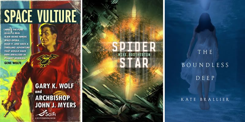
Space Vulture: Taking a page out of Hard Case Crime's play book -- pitch perfect retro art by Glen Orbik.
Spider Star: First time working with Daniel Dociu. A pleasure to work with -- we’ll be seeing him many covers in the future, I'm sure.
The Boundless Deep: Eerie and pretty. Thanks to Jamie Stafford-Hill.
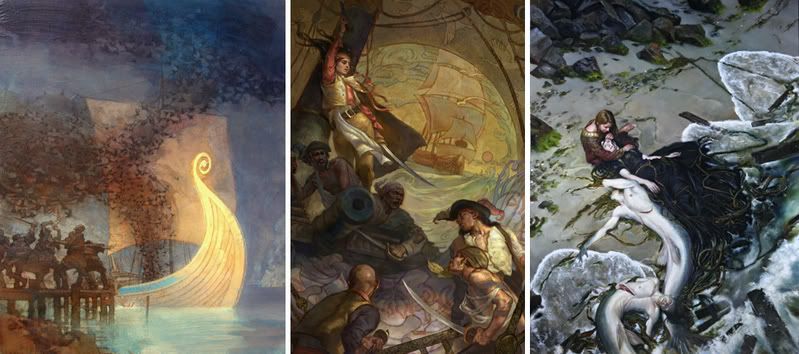
And a trio of nautical themes:
David Grove for David Keck’s In a Time of Treason
Shelly Wan for Misty Massey’s Mad Kestrel
Donato Giancola for Kathleen Bryan’s The Golden Rose
Spaceman Blues, the Alternate Covers

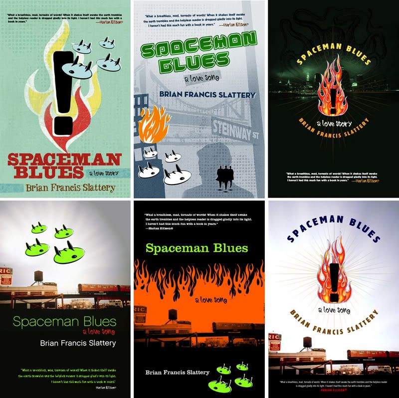 At BEA Brian Francis Slattery asked about how we came to the cover of his Spaceman Blues novel. I had to admit that I loved the book way too much to touch it myself so I handed it over to Peter Lutjen –- Tor’s amazing senior designer. When Peter first showed me the comps I was still too attached to the book to really see them clearly. I finally understood what I suspect our editors often feel, not to mention the authors. If I remember correctly I think I made Peter do revisions on some of the alternate versions before suddenly realizing that one of the original comps -- the top one pictured -- was simple, direct, and perfect for the book. Brian seems to agree. Let's hope readers do.
FROM DESIGNER PETER LUTJEN:
“I really loved this book, but have had a very difficult time trying to describe it to people, and found it equally challenging to come up with a cover to do it justice. There is an incredible rush of imagery right from the start of the story, and it never really lets up throughout. With so much great material to work with, my initial attempts ended up a bit too cluttered. I hope the final jacket is just suggestive enough of the weirdness and chaos inside.”
Cherie Preist
After getting in to work at 4:00PM due to a raging migraine all morning, it was pretty great to see an email titled "Just in case no one has told you you are awesome today." Editor Liz Gorinksi sent me a link to some praise from Cherie Priest. (Four and Twenty Blackbirds, by the way, is an excellent read. I hope to get back to the other two at some point.) Now: Headache gone, back is patted...life aint so bad.
Thanks to John Jude Palencar (who has often told me he particularly likes working on these books) for the artwork and Peter Lutjen for the awesome design.
Thanks to John Jude Palencar (who has often told me he particularly likes working on these books) for the artwork and Peter Lutjen for the awesome design.
Voices From the Street

 Here's one that is out in the stores now. Deign by Peter Lutjen. The tricky part here was taking a mainstream novel and making it look sf-nal enough to let bookstores shelve it wherever they feel their costumers are most likely to look for it. The thumbnails show some alternates. I still like the first of the alternates best but Sales felt it wasn't striking the science fiction cords hard enough. We are publishing four early Philip K. Dick novels. Peter is at work on Humpty Dumpty in Oakland right now.
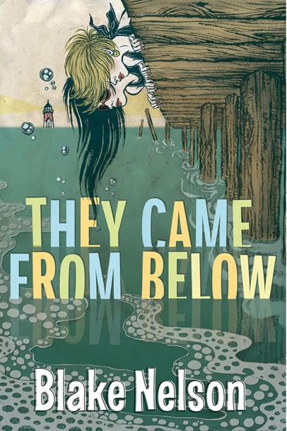
It Came From Below
Because it looks cool...

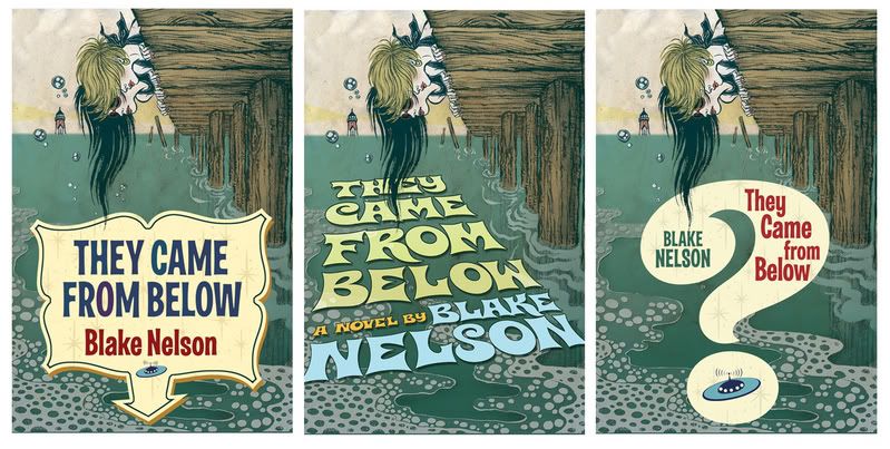
 Two high school girls are on vacation and looking for boyfriends...instead they find sea creatures that look like Brad Pit.
Yuko Shimizu did the drawing. As you can see here, Yuko is amazing. Peter "no less amazing" Lutjen did the type layout. The top one is the final. I was very tempted to go with some of the other versions, but in the end I think the added elements compete with the art too much -- you are either looking at the art or the type, but not both together. The simpler type does a better job at complimenting the art and making a cohesive package.
This book will release next summer. Only a few bookstores have seen it at this point but, so far, they are raving about it. Each season there is a cover that I love but I assume that others wont pay much attention to...And every now and then I'm wrong. A few seasons ago that cover was When Gravity Fails. I was very surprised how well our Sales force responded to that cover...even though it was one of my favorites.
Shriek
 I really don't mean for this blog to be so Tor-centric but...
Shriek just came into the office and I love what our senior designer, Peter Lutjen, did with this Jonathan Edwards photograph. The interior design department (which is oddly separate from the art department) created a great text layout for the book as well.
Subscribe to:
Posts (Atom)